

What does share of voice measure?
Your slice of all brand mentions, not your slice of all answers. When an AI engine names five brands and one of them is you, share of voice is how often you’re the one being named.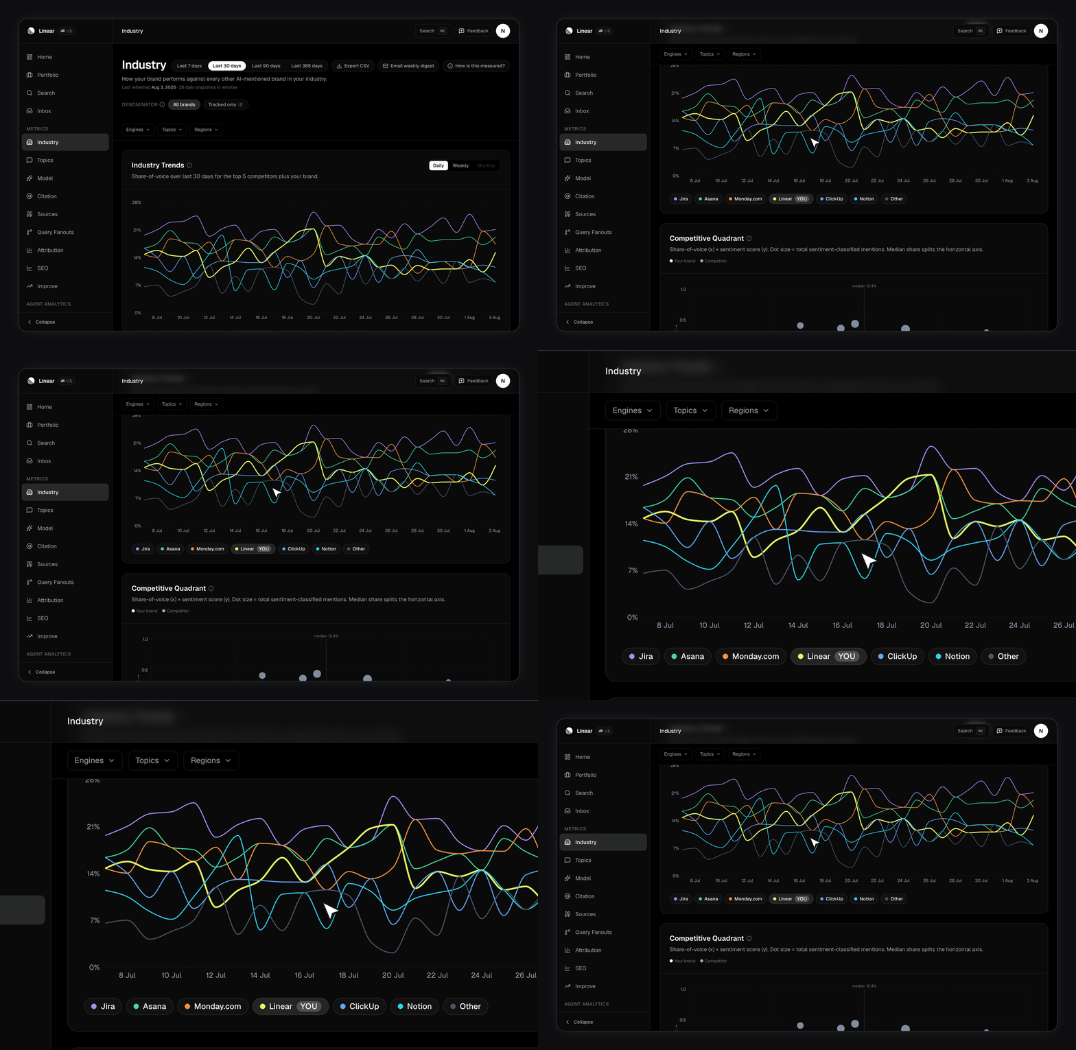
A methodology popover in the page header explains the metric in place. It’s there so anyone you send a screenshot to can see what they’re looking at.
The four cards
Industry Trends plots share of voice over time for your closest competitors, plus you, plus an “Other” bucket for everyone else. The legend stays short enough to read. Industry Ranking is the table: every brand ordered by share, with its mention count and its change. Click any competitor row to open a drilldown. Your own row isn’t clickable — there’s nothing to compare you against yourself. Competitive Quadrant plots share of voice on the x-axis against sentiment on the y-axis. Dot size is how many classified mentions a brand has. Tracked competitors is where you pin rivals so they show up even at zero mentions. See Tracking competitors.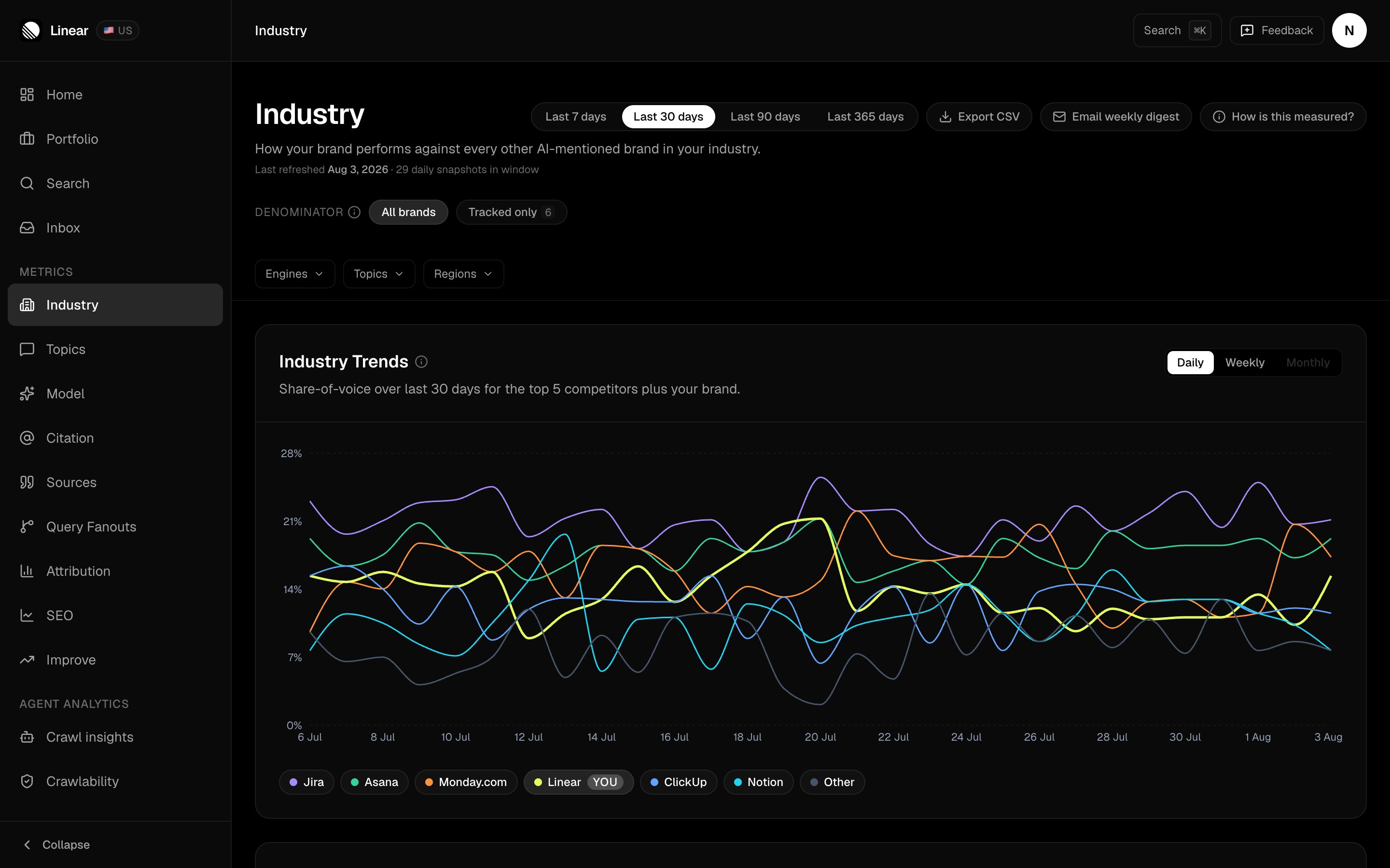
The date range, denominator toggle and engine, topic and region filters in the header re-scope every card below them.
What’s in the competitor drilldown?
The most useful thing on the page. Click a competitor and you get three numbers up top: their cells, your cells, and the gap between the two. A cell is one prompt × one AI engine × one day. So 10 tracked prompts × 6 engines × 30 days = 1,800 cells in a 30-day window. The drilldown counts how many of those cells named the competitor vs how many named you.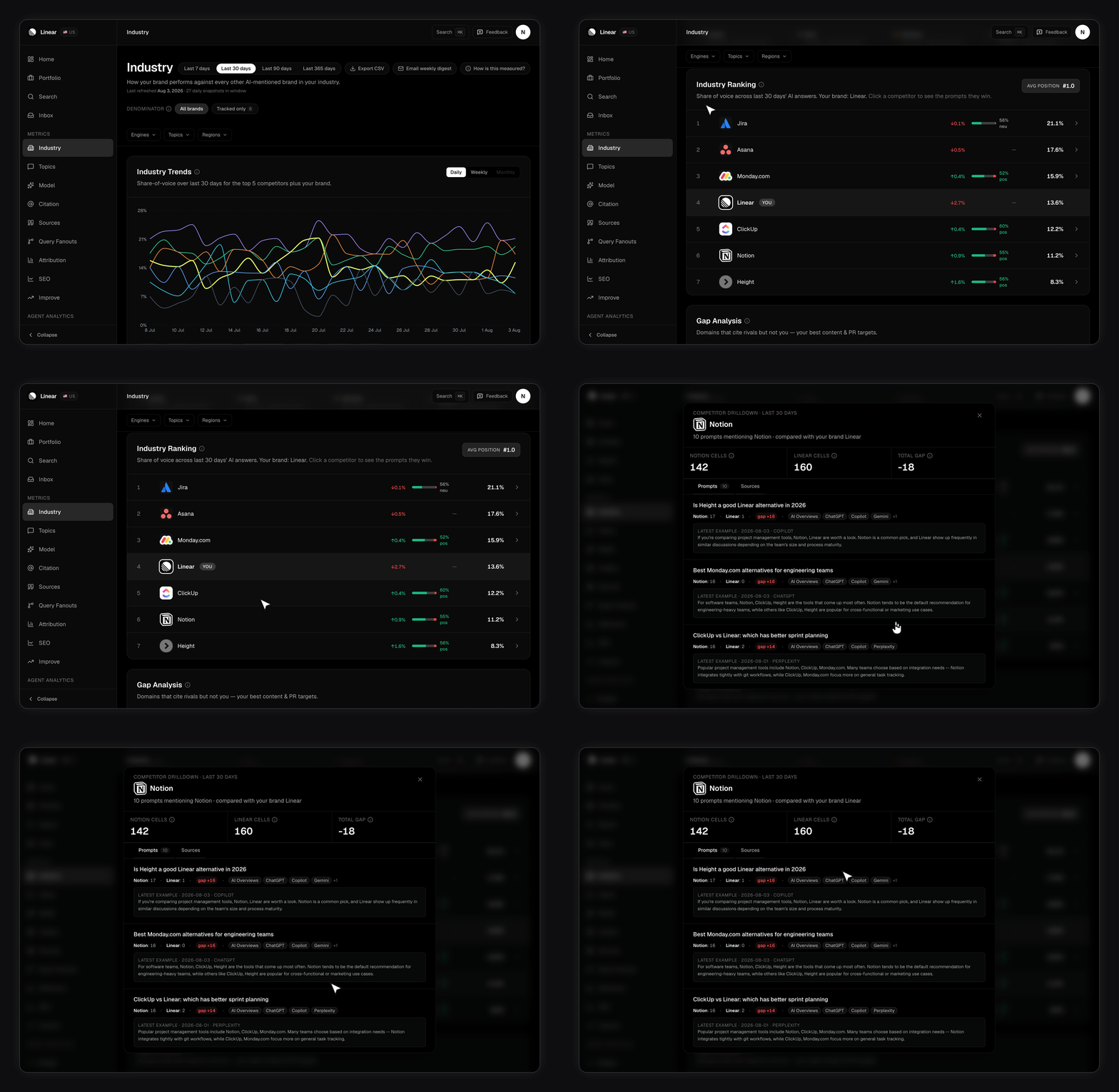
The drilldown counts cells. The ranking table above it counts mentions. Those are different units, so the competitor’s number in the drilldown won’t match the mention count on the row you just clicked. Read each one on its own terms rather than reconciling them.
Why is my quadrant empty?
It needs at least two brands with sentiment data in the window — you plus a rival, or two rivals. Below that it shows a message instead of a chart.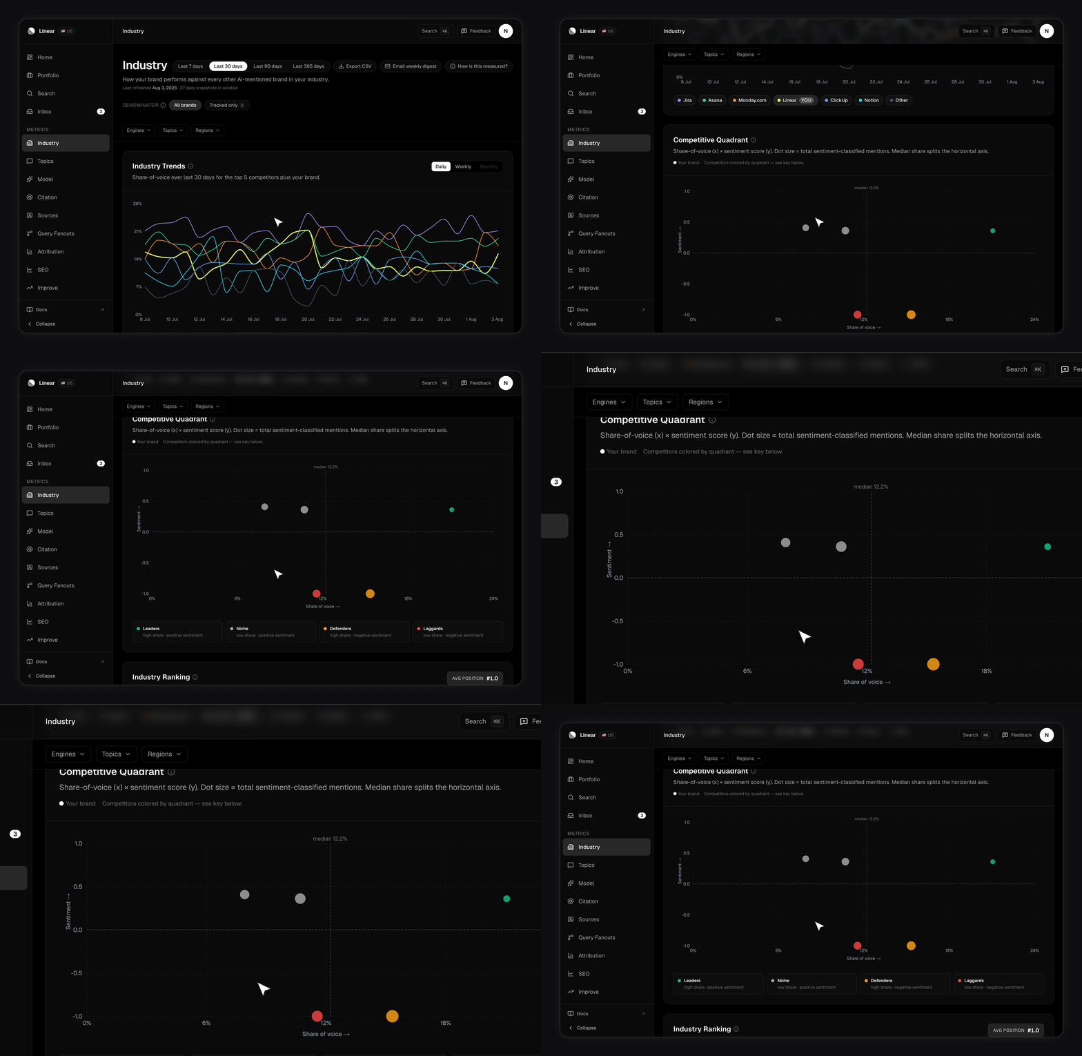
Which denominator should you use?
There’s a toggle, but only once you’ve pinned at least one competitor.- All brands measures you against every brand the scanner detected. The honest baseline.
- Tracked only measures you against your pinned competitors. Answers “how am I doing against the four rivals I care about”.
Narrowing the view
Filters stack across the whole page: engine, topic, and region. Engine chips only offer the engines your plan scans — see Plans and limits. Topic chips come from your clusters on Topics and labels. The region row gives you something to choose between once a brand has data from more than one country. You set a brand’s scan region on Your brand profile. Two extras sit in the header. CSV exports the current filtered ranking. Email weekly digest sends a summary of the week to your inbox straight away.The weekly digest also arrives on its own
You don’t have to press that button. The same digest sends automatically, once a week, whether or not you ask for it.- When. On the weekday you signed up, counted in UTC. Sign up on a Tuesday and it arrives on Tuesdays.
- What’s in it. Every brand on your account in one email, not one email per brand.
- When it doesn’t arrive. A week with nothing worth reporting is skipped silently, so a gap isn’t a bug.
Related
- Tracking competitors — detection, pinning, and how many to track.
- Share of voice — the metric definition.
- Understanding your dashboard — the compact ranking widget.